
Do you spend tons of time writing, formatting and perfecting the content and design on your website and then realize it isn’t mobile-friendly?
Most bloggers and content creators work from a laptop or desktop when creating the majority of their content. Who wants to type out a long blog post on their phone?
As smartphone ownership and use has increased to basically everyone, blog viewership from a mobile device as increased along with it. For food bloggers, mobile and tablet viewership often averages 75% or higher. This means at least 3/4 of your followers are reading your blog on their phones or tablets.
So, this creates a huge disconnect between how bloggers create, and how followers often consume the content. This means you need to take steps to make sure your content looks great on all size screens as well as on a laptop or desktop.
If want more in-depth details on how to make sure your blog is mobile-friendly, read my article, Tips for Making Your Blog Mobile-Friendly.
Thankfully, reviewing your content to make sure it is mobile-friendly is easier than you think! Here are three ways you can easily preview your website or blog post on mobile.
1. RESIZE YOUR BROWSER
This is the quick and easy way. Resize your browser, then shrink and enlarge it to see how it changes at different viewing sizes. This will give you a good idea how your site will look on screens of different sizes.
2. USE A SCREEN SIZE VIEWING TOOL
Use a tool like responsinator.com. When you enter the url you are working on, this site will show you how it looks on several different screens. Keep scrolling down and you’ll be shown landscape and portrait views for a variety of different devices.
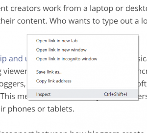
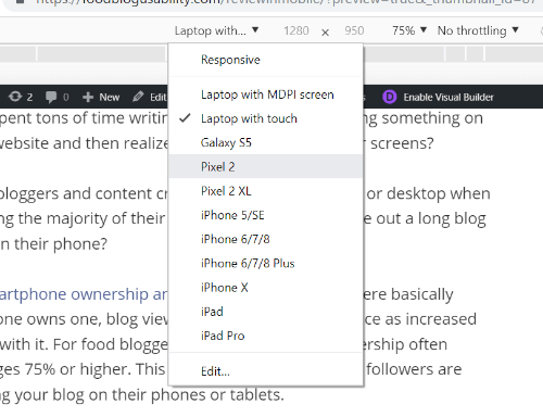
3. USE “INSPECT” IN YOUR BROWSER
If you are using Chrome you can right-click in your browser and select “inspect” at the bottom. This will pull up developer tools. You’ll see some code on the right. But, in the center, you’ll see your site and you can use the options in the top bar to adjust the size. THIS IS MY FAVORITE WAY!⠀
Right-click and you will see an option for “Inspect”. Select it!
Then on the top navigation bar you will see a drop-down that lets you select different size screens.
And, if you want more help in figuring out if you are creating user- and mobile-friendly content read, Tips for Making Your Blog Mobile-Friendly.


